Color theory is the study of how colors interact, how they’re perceived, and how they can be combined to create harmony, contrast, and visual impact. It’s used in art, design, branding, film, user interfaces, and anywhere visual communication matters.
The Color Wheel
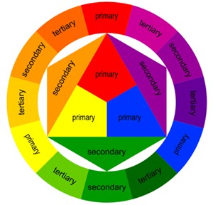
🎨 The Color Wheel is a circular diagram showing the relationships between colors. They are divided between Primary, Secondary and Tertiary.
Primary Colors: Red, Yellow, Blue (traditional painter’s primaries)
Secondary Colors: Created by mixing two Primaries. Orange, Green, Purple.
Tertiary Colors: Mixing a primary with a neighbouring secondary. Red-Orange, Yellow-Orange, Yellow-Green, Blue-Green, Blue-Purple, Red-Purple
Color Harmony
🎨 How to combine colors pleasingly.
- Complementary: Opposites on the wheel (e.g., blue & orange). High contrast.
- Analogous: Neighbors on the wheel (e.g., blue, blue-green, green). Smooth, calm.
- Triadic: Three evenly spaced colors (e.g., red, yellow, blue). Balanced and vibrant.
- Tetradic/Double Complementary: Two complementary pairs. Rich but can be busy.
- Monochromatic: Variations of one hue. Very cohesive.
Color Properties
🎨 Each color has three characteristics.
- Hue: The color family (red, blue, green…)
- Saturation: Intensity or purity (vivid → dull)
- Value: Lightness or darkness
- Tint = hue + white
- Shade = hue + black
- Tone = hue + gray
Color Temperature
🎨 Temperature affects mood and spatial perception.
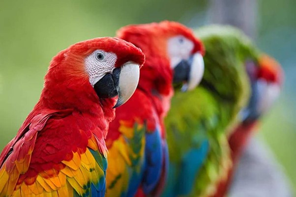
Warm Colors: reds, oranges, yellows → energetic, passionate, attention-grabbing
Cool Colors: blues, greens, purples → calm, peaceful, professional
Phycological Associations
🎨 Color meanings vary by culture, but common associations include:
- Red: excitement, danger, passion
- Blue: trust, calm, stability
- Green: nature, renewal, balance
- Yellow: optimism, warmth, caution
- Purple: luxury, creativity
- Black: elegance, power, mystery
- White: purity, simplicity